
For this Transformation Tuesday, our talented Dallas Interior Designer, Jessica Stringer is going to guide us through this gorgeous corporate design. Enjoy watching this ugly duckling transform into a beautiful swan before your eyes.

The building houses various medical offices and had not been updated in quite a while. It was very dull and there was nothing decorative to bring life to the space. Also, many of the materials in the building were outdated and were showing wear and tear in a way that was not aesthetically pleasing to anyone.


The client asked for a space that was updated and fresh where their tenants could walk in and feel proud to be working in the building. We needed to keep costs down as much as possible and try to work with as many of the existing design elements as possible. We opted to keep and work around the existing doors and windows as well as the layout in order to maximize the impact of the budget on the decor and finishes.


1. The only natural light coming into the building is from the two entrances. The existing fluorescent lights in the ceiling gave off harsh, cold lighting and made the long hallway feel bleak and dreary. Our Dallas Interior Designers, Jessica and Lisa, replaced it with chandeliers and some recessed can lights that brought in warmer, softer lighting and made the space feel much more inviting.
2. Custom benches in order to provide seating outside offices without blocking pathways for patients and staff.
3. The extremely long hallway was a major challenge, we needed to add art and mirrors to help give visual and design interest and break up large spans of blank walls. New wallpaper also brought in texture and a soft design pattern that helped break up the height of the walls where the angled wall goes up to the ceiling.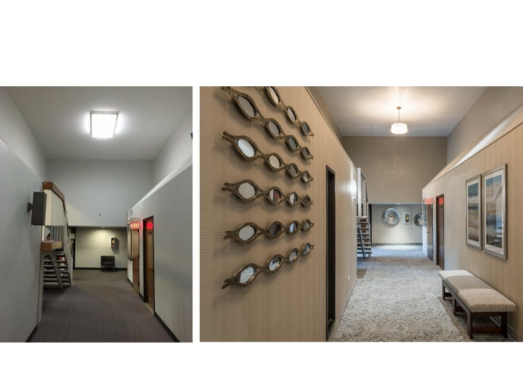

1. New flooring in the entrances and carpet in the hallway really transformed the space and made it feel updated. The flooring combined with the new furniture in the seating areas really helped to make this Dallas office feel warm and welcoming. This is the first impression patients have when they walk in, so it was important that they feel comfortable.
2. We also painted the brick white in the secondary entrance in order to tie it into the brick that had been painted white in the main entrance. This gave a much more cohesive design look when standing in the hallway and seeing both ends.

Want to update or overhaul your work space? Whether you work from home or commute to a work space every day, we have you covered on all things dallas office design! To chat with a designer about your needs, contact us today!
