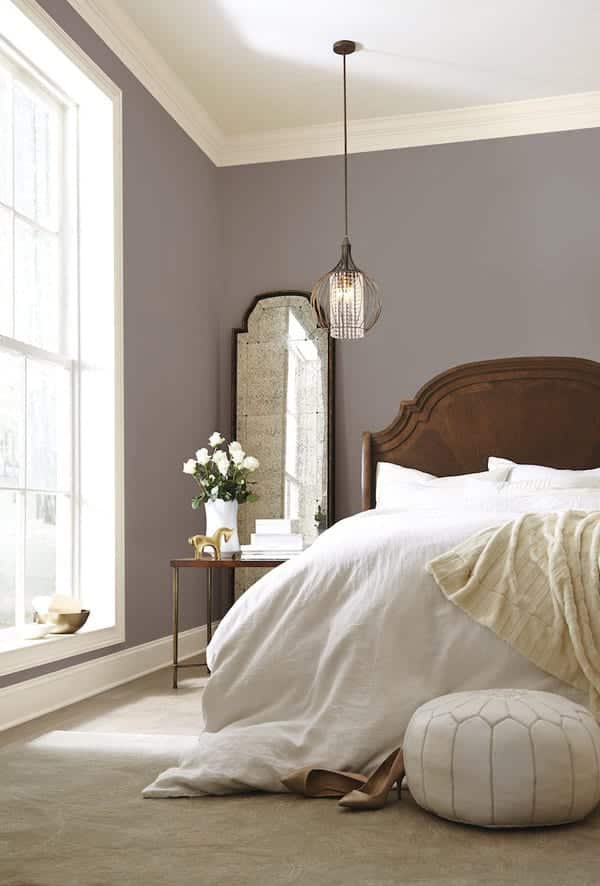
The design world is buzzing about Sherwin William’s 2017 color of the year, Poised Taupe. There is plenty of commentary on the color, but what about it makes it worthy of the selection? The Baker Design Group design team gave their insight.
“With the oscillating desire for warm and cool tones within design, finding the perfect taupe-y gray has become essential for timeless spaces”
Perfectly timed with designer, client, residential, and corporate trends, Sherwin-Williams announced that it’s color of the year is one that fits the bill for a perfect taupe-y gray! Poised Taupe is a name you will hear and a color you will see this year.
All about Poised Taupe (SW 6039):
- The color comes from Sherwin-Williams’ “Noir” palette, it is a combination of earthen brown and conservative gray.
- We’ve heard a lot about poised taupe from Sue Wadden, director of Color Marketing at Sherwin Williams (fun job!) like how “It’s been described as what you’d get if tan and brown had a baby, but in reality it’s a darker take on the very popular “greige” trend.”
- She also described the color as one that “celebrates everything people love about cool gray as a neutral, and also brings in the warmth of brown, taking a color to an entirely new level. Not cool or warm, nor gray or brown, Poised Taupe is a weathered, woodsy neutral bringing a sense of coziness and harmony that people are seeking.”
“Colors like this Poised Taupe allow us to mix cooler tones of silvers and grays with warmer tones of golds and brown woods seamlessly. In the end, we find the most comfortable AND beautiful spaces marry warm and cool tones in harmony”
Lisa and Jessica were discussing the new popular greige and pointed out that it has more complex bones than a simple grey + beige. Interestingly, this shade of taupe boasts a slight mauve undertone, pulling from cooler purple and rosey tones to achieve it’s exact hue. It’s important to understand how your lighting, and other color selections in a space will affect how your wall color appears.
Natural and accent lighting, fabrics and rugs, metallic accent choices, and even your choice shade of white on those base boards and moldings, have the power to either highlight and emphasize or downplay colorful undertones even in a seemingly neutral paint choice.
Above in this neutral living room, furniture and accessory choice took the room to the warm side, playing up the warm tones in the paint color, while this kitchen took a neutral white to be crisp, clean, and cool. See how a seemingly neutral paint choice can be played up either way?
Color Is Warming Up
Commercial interior design can follow similar trends as residential interior design. Poised Taupe is a warmer alternative than the plain grays that have dominated in the corporate scene lately. “Since commercial color direction tends to enjoy longer lifecycles, Poised Taupe is on the forefront of this trend, offering the ability to endure over time, yet complement a wide range of designs,” quoted Wadden. We love the language of Wadden when she describes Poised Taupe. Her strong, action words show that color has the power to transform a space! We agree.
