Every December, the design world collectively pauses for Pantone’s Color of the Year announcement. From interiors to fashion to product design, the chosen hue often dominates conversations overnight. While Pantone remains a powerful trend signal, relying on a single color to define an entire year can feel limiting—especially in homes meant to reflect personality, lifestyle, and longevity.
At Baker Design Group, we believe color should do more than follow trends. It should tell a story, evoke emotion, and enhance the way a space is lived in. That’s why, instead of waiting for one global pick, we curate our own Interior Design Colors of the Year—a thoughtful palette drawn from real projects, real clients, and real spaces.
Our 2025 color selections celebrate depth, versatility, and timeless appeal. These hues aren’t just beautiful on a swatch; they elevate interiors in meaningful, lasting ways.
Below, we’re sharing our 2025 Colors of the Year and how we’re using them in luxury residential design.
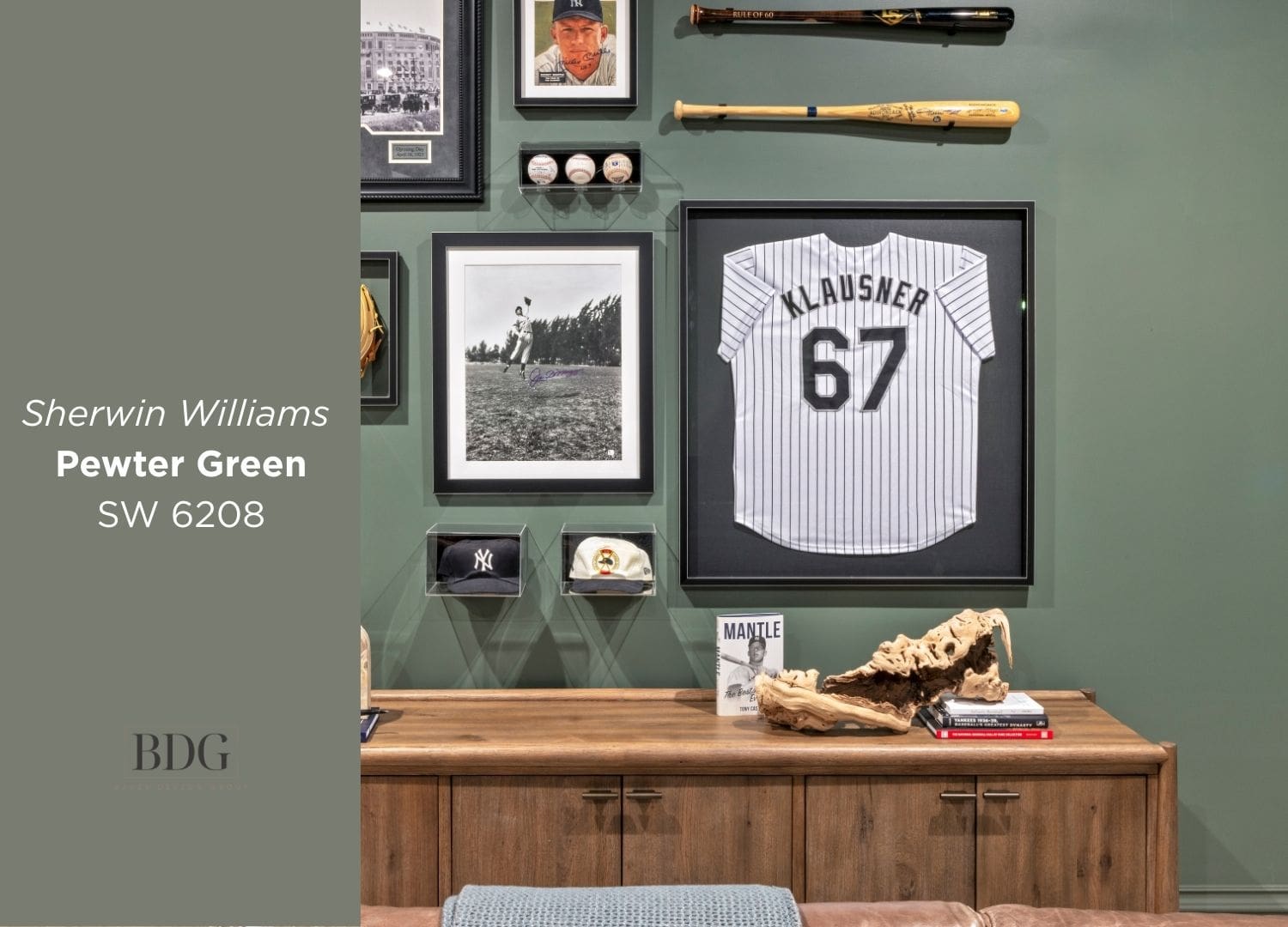
Sherwin-Williams Pewter Green (SW 6208): Moody Elegance
Pewter Green is a sophisticated blend of richness and restraint. In a recent custom home theater, this moody green envelops the space, creating a cinematic atmosphere that feels intentional rather than heavy. Paired with deep leather seating and curated sports memorabilia, Pewter Green grounds the room while allowing personal elements to shine.
This hue is ideal for media rooms, studies, or libraries—spaces where comfort, depth, and quiet drama matter most.
Why it works: Rich without feeling overpowering, Pewter Green delivers warmth, elegance, and emotional depth.

Sherwin-Williams Iron Ore (SW 7069): Bold Architectural Accents
Iron Ore has become our go-to for statement accents, especially in kitchens. Used on custom vent hoods and island cabinetry, it provides striking contrast against lighter surroundings while pairing beautifully with brushed brass hardware.
This deep charcoal-black adds structure and sophistication without overwhelming the space. When layered with texture and reflective finishes, Iron Ore actually enhances light rather than absorbing it.
Why it works: Dramatic yet refined, Iron Ore anchors high-traffic spaces with confidence and polish.
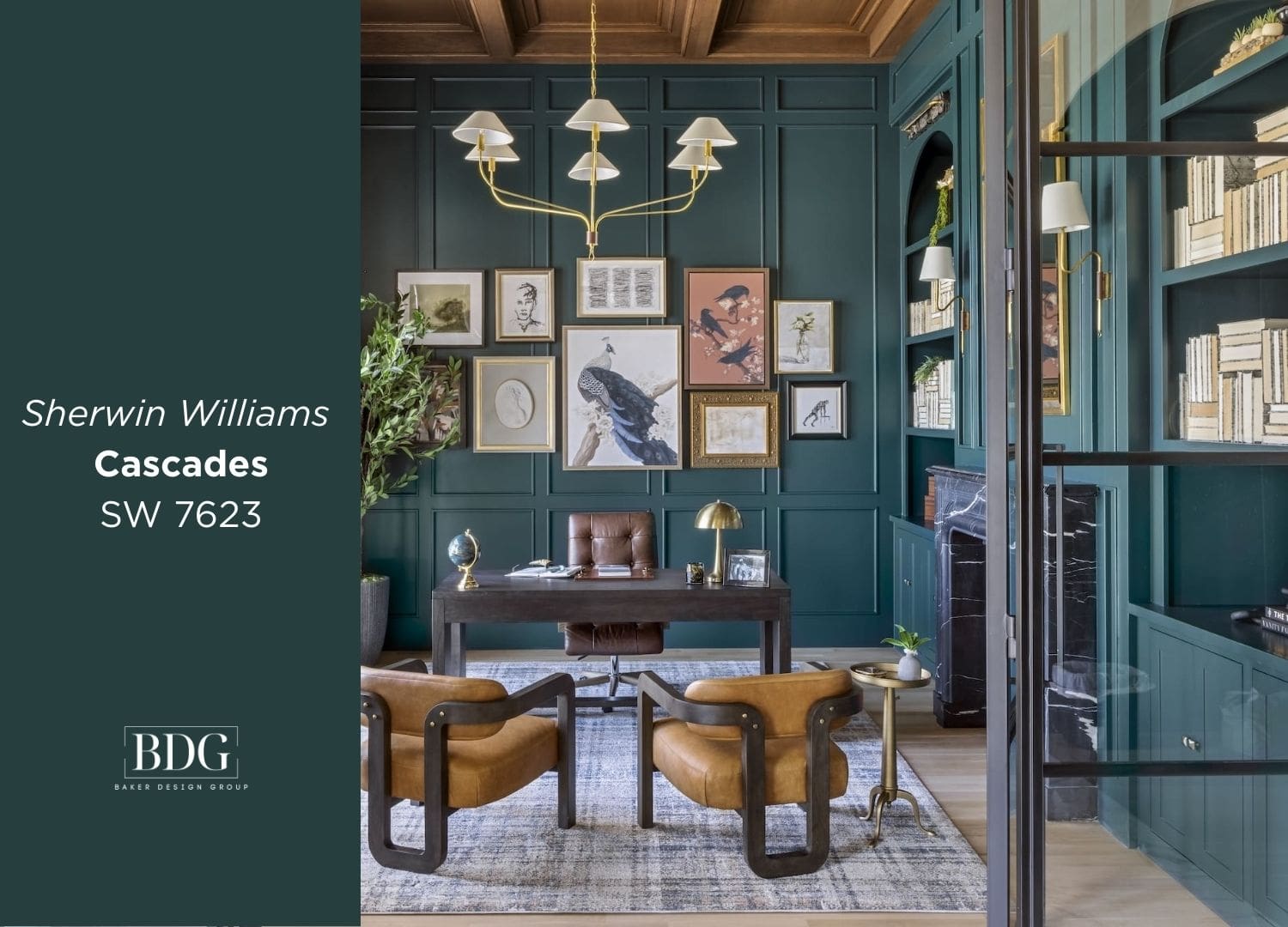
Sherwin-Williams Cascades (SW 7623): Drama Meets Tradition
Cascades is a deep, versatile blue that feels equally at home in a grand entry or a tailored home office. In one of our recent projects, we layered Cascades with traditional architectural details to strike a balance between boldness and approachability.
This color excels in transitional spaces—areas that set the tone for the home while still inviting people in.
Why it works: Cascades delivers impact without intimidation, making it ideal for statement-making first impressions.
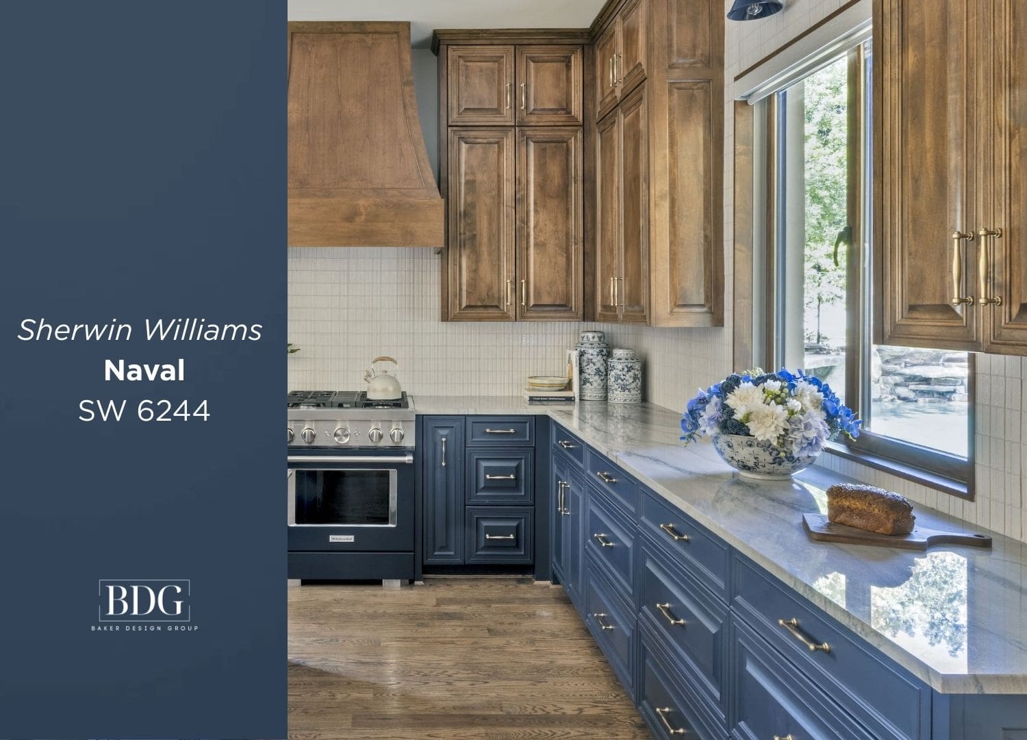
Sherwin-Williams Naval (SW 6244): Classic Depth
Naval continues to be a standout for cabinetry, and for good reason. In our kitchen designs, we often pair Naval with warm natural wood tones to create a look that feels both grounded and elevated.
While dark blues can sometimes feel heavy, Naval maintains a classic depth that ages beautifully—especially when softened with organic materials and thoughtful lighting.
Why it works: Timeless and enduring, Naval offers longevity far beyond seasonal trends.
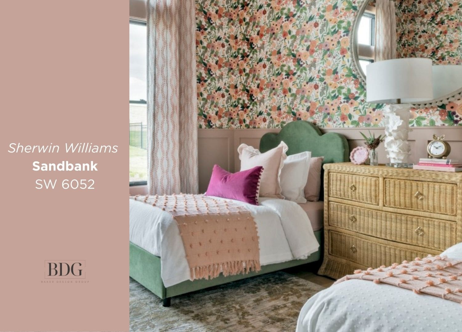
Sherwin-Williams Sandbank (SW 6052): Soft, Playful Warmth
Bold color doesn’t always mean dark. Sandbank, a soft and inviting pink, brings warmth and personality to playful spaces like bedrooms or creative rooms. In one of our recent designs, it served as a gentle backdrop that allowed texture, pattern, and furnishings to take center stage.
Sandbank proves that lighter hues can still make a statement—one rooted in joy and approachability.
Why it works: Soft yet expressive, Sandbank creates warmth without overpowering a space.
A Curated Color Palette, Not a Passing Trend
While Pantone may drive headlines, our Colors of the Year are driven by how people actually live. From moody greens and deep blues to soft, playful pinks, this curated palette reflects our belief that the most successful interiors are layered, personal, and timeless.
At Baker Design Group, we don’t chase trends—we translate them into meaningful design choices. Our 2025 Interior Design Colors of the Year offer homeowners the confidence to use color boldly, thoughtfully, and beautifully.
If you’re ready to explore how color can transform your home, our team is here to guide the process—from concept to completion.