How about this dramatic kitchen transformation?
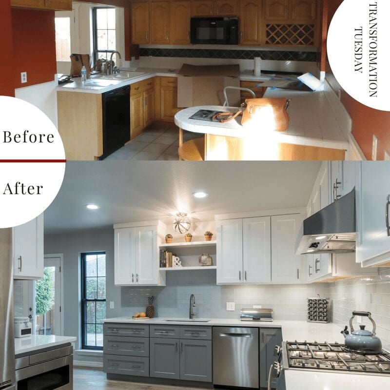
“From dark and dated to light and airy..” If you’ve read our other #transformationtuesday posts, you may notice that this is a theme. It is a pattern we love following! Taking a room from an enclosed, dated-looking space to one that is more timeless and open and functional for everyday use is consistently a positive change.
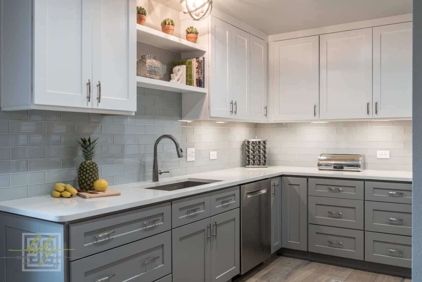
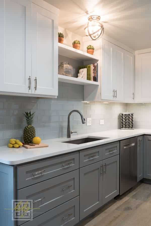
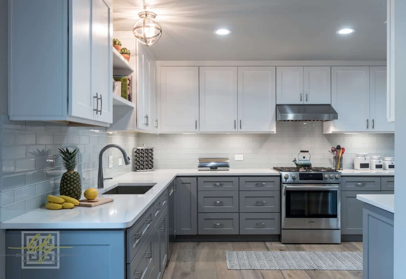
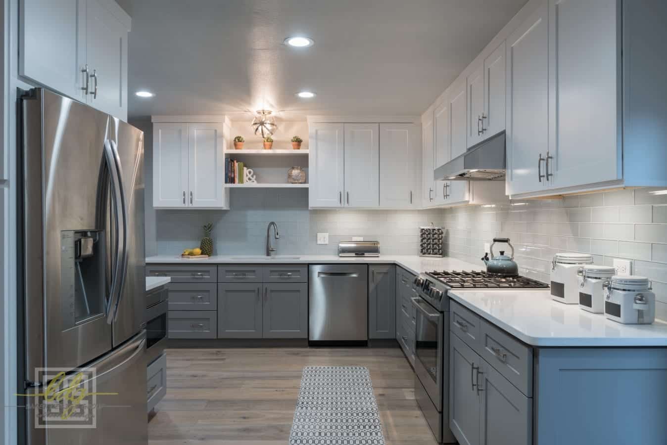
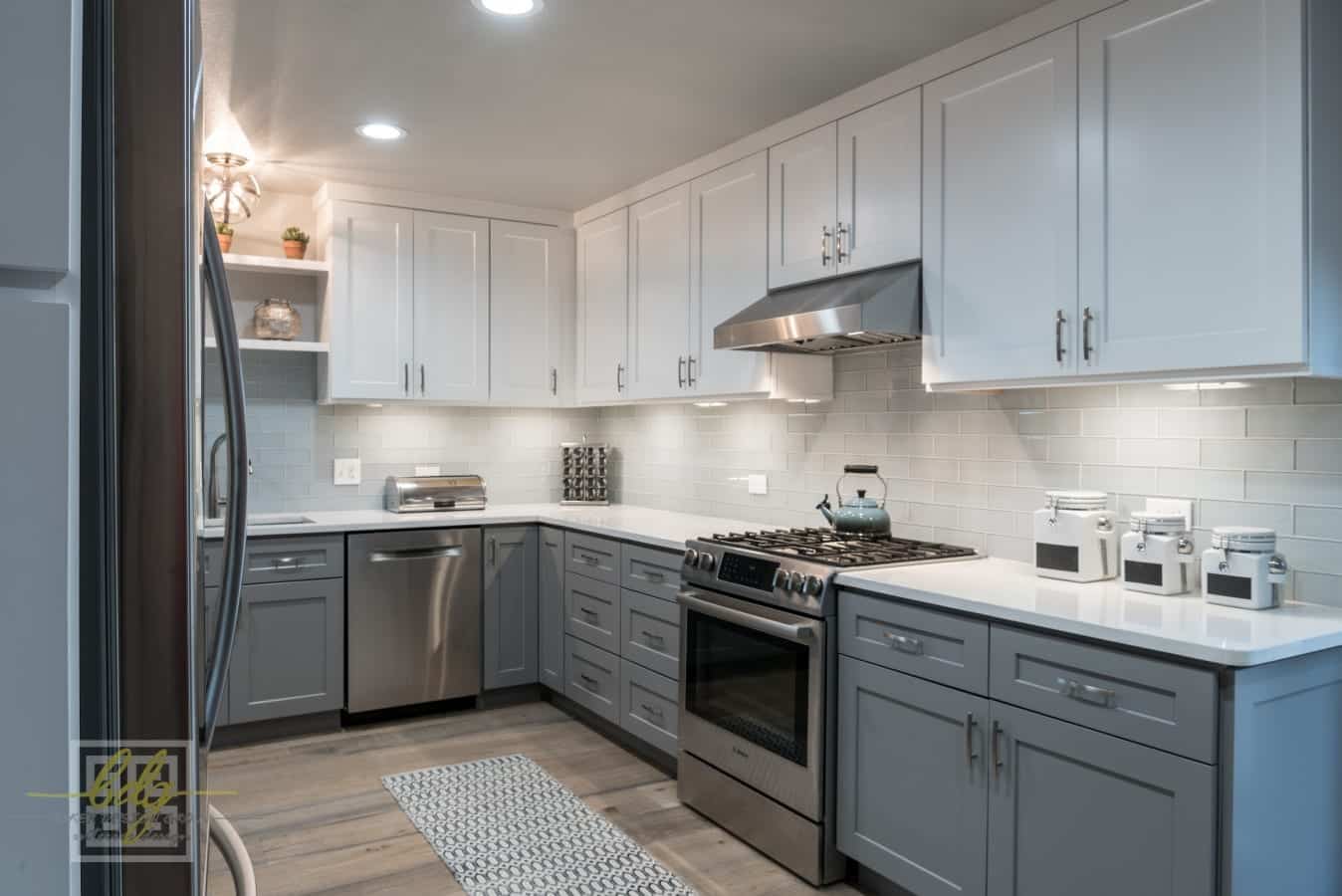
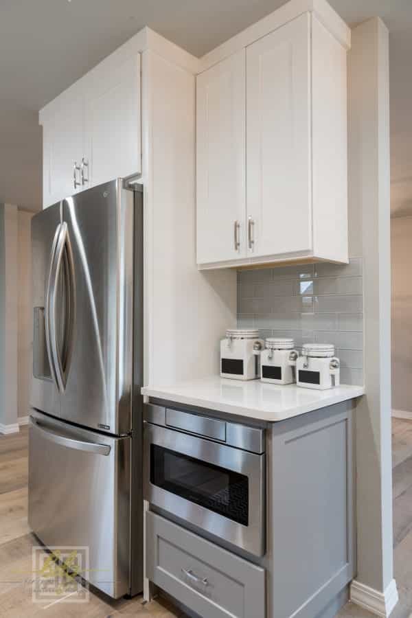
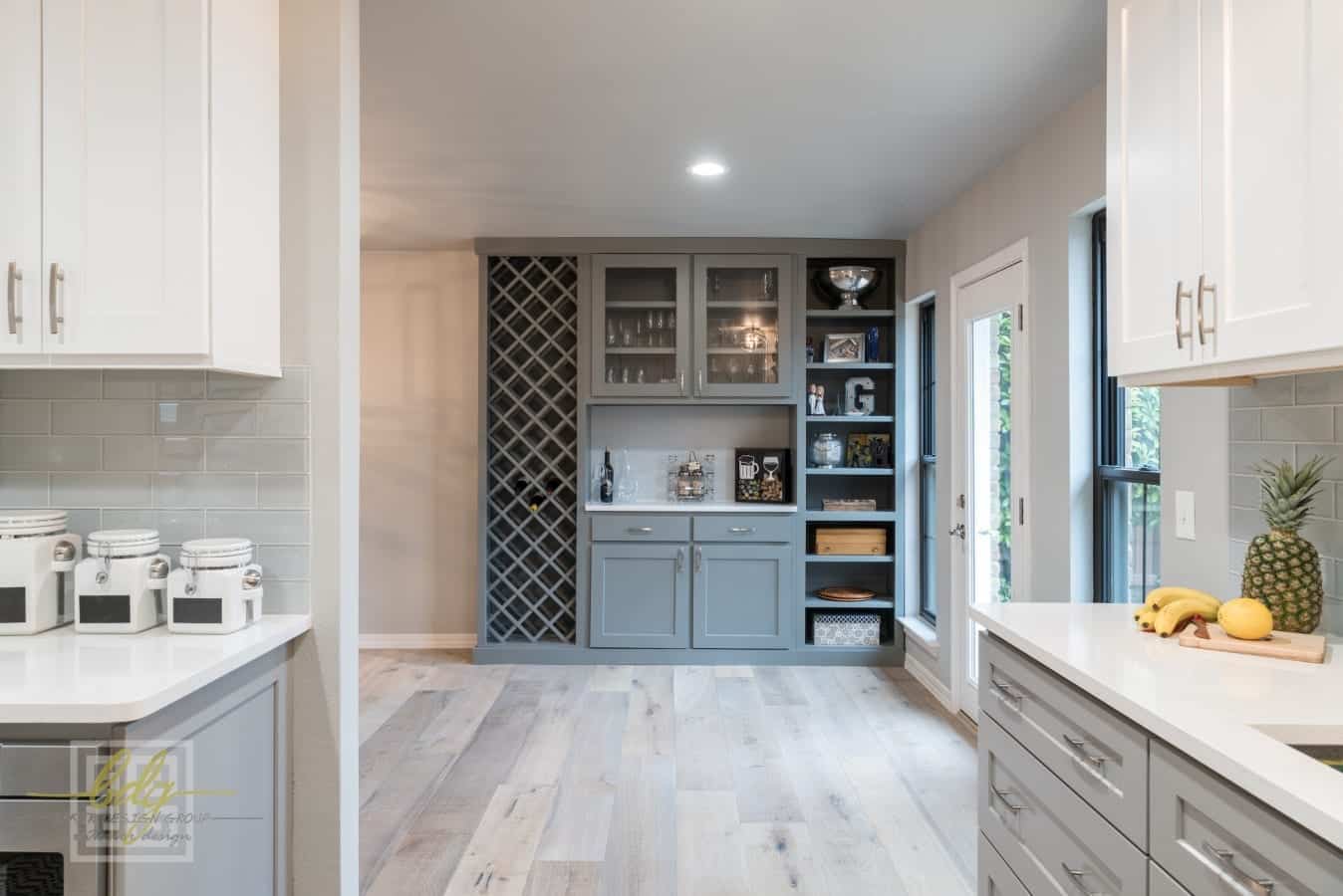
AFTER
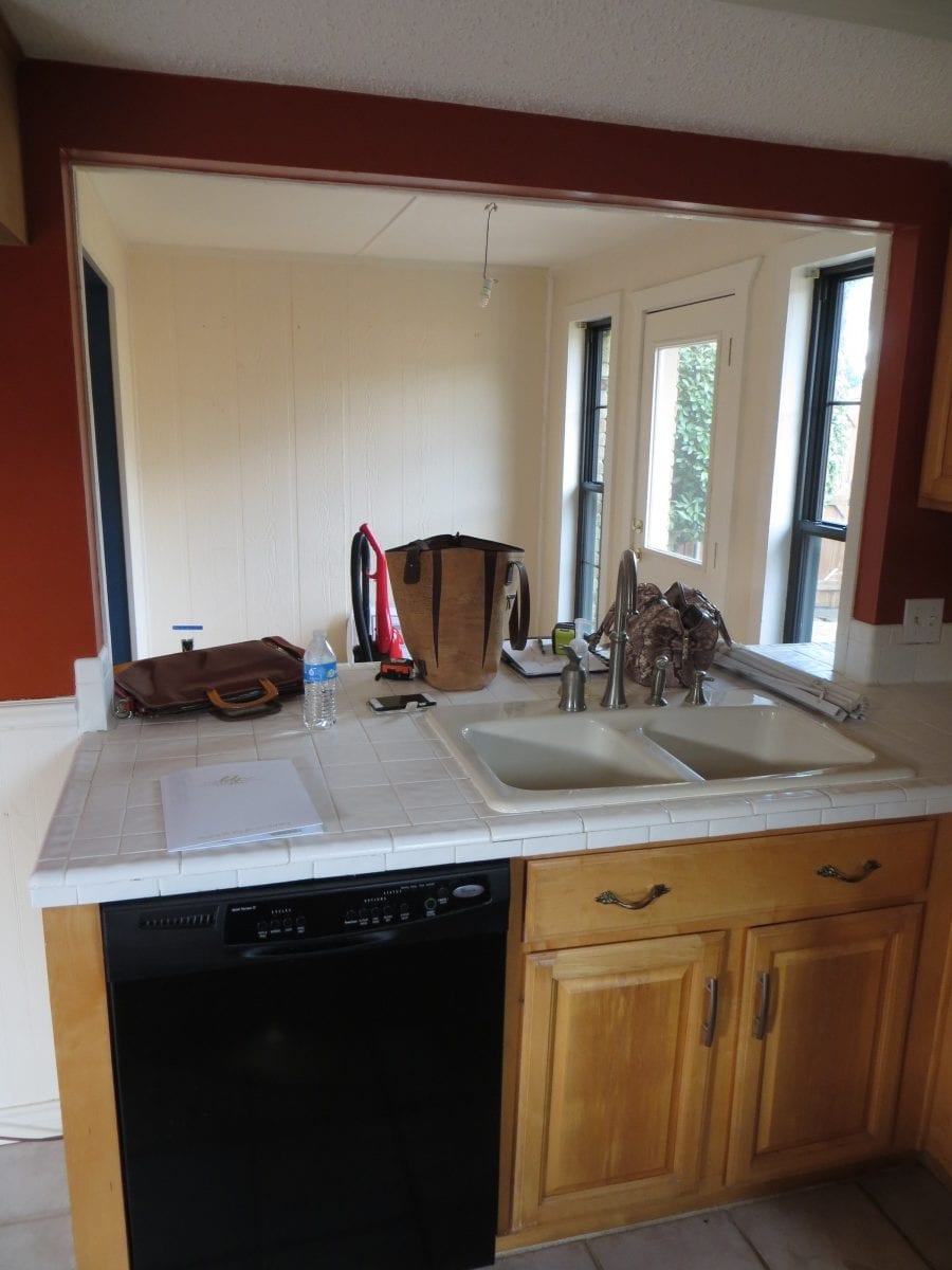
BEFORE
Compare the flooring, backsplash tile, and cabinet color between these two photos.
Before: Small-squared tile with difficult to clean grout, warm wood cabinets with dated hardware, and white backsplash with dark green banding.
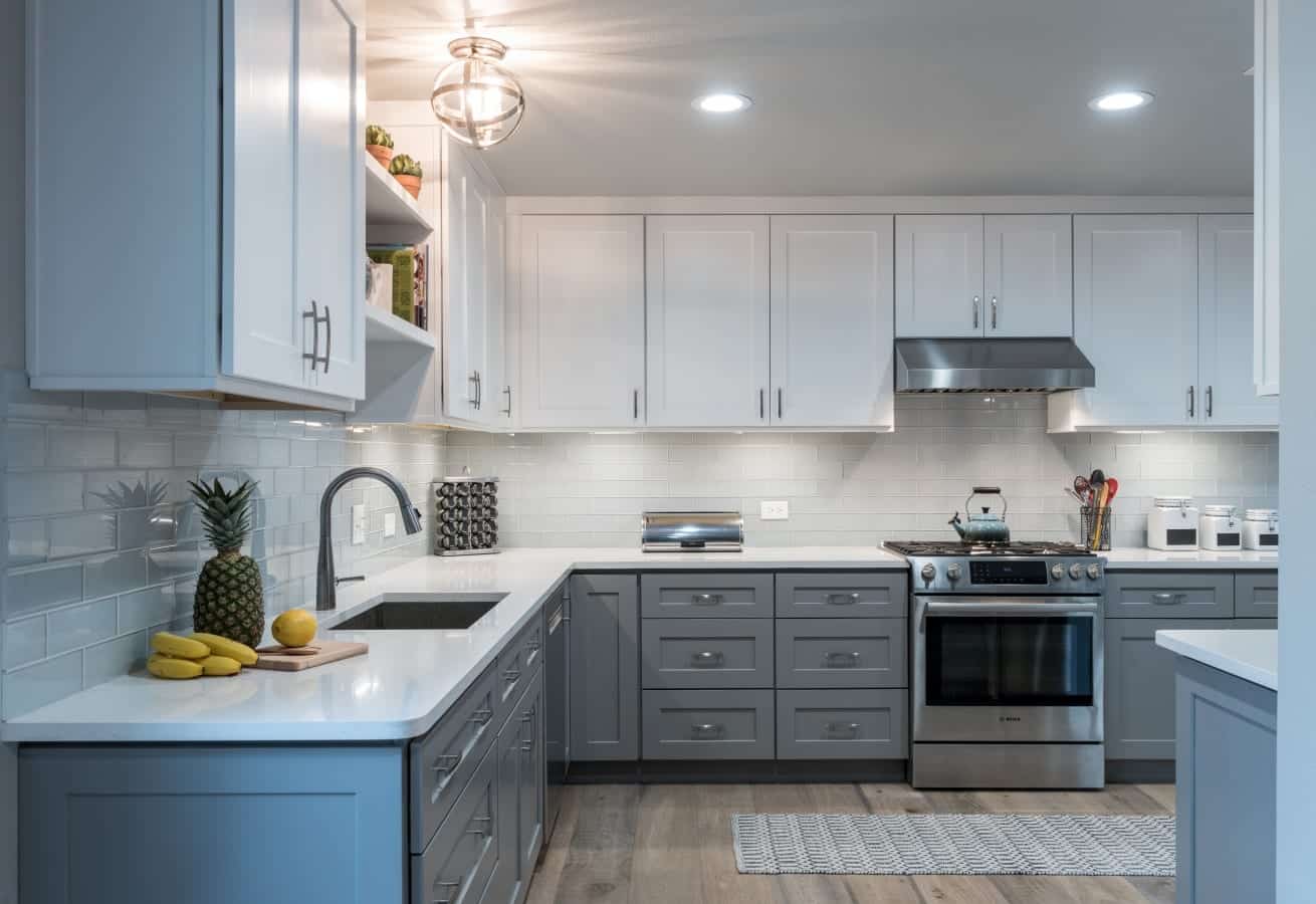
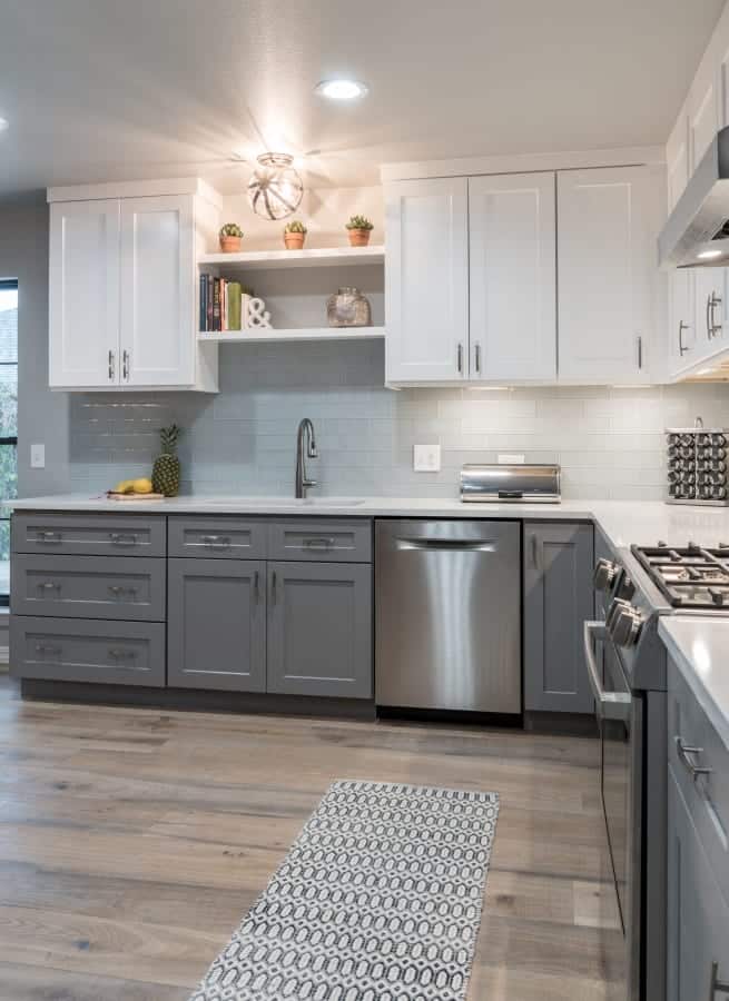
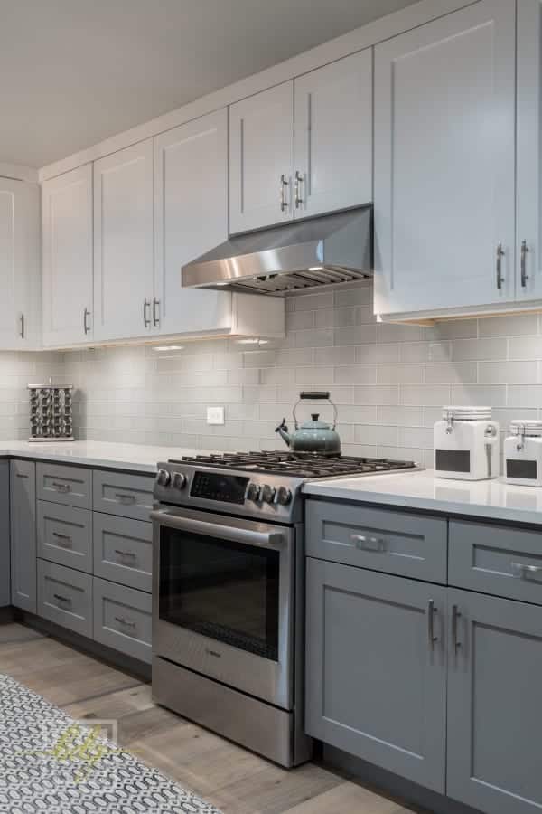
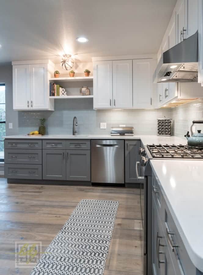
After: Wood-look tile (we love this!), blue-gray painted cabinets that compliment blues in nearby area of the home in the bottom with bright white, clean-lined cabinets above to visually lift the ceiling, and light gray glass tiles backing the entire kitchen wall
AFTER:
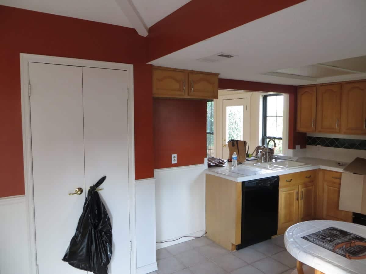
BEFORE:

We knocked out some walls! By moving the sink and taking out the wing of the counter pictured above, we expanded the back living area.
Even though this was a small space with a limited budget, this transformation was a “stunner”. We removed all the heavy brick pillars and raised the ceiling in the kitchen to give a larger feel to a more petite footprint.
We brought so much more functionality to both the kitchen area and the dining/wine retreat area by removing the existing counter area and opening this up without losing storage.
Using two tone cabinets gives more interest to a more predictable design adding value, and unexpected touch to this modern look
Thank you for following along with our Transformation Tuesday! We hope you enjoyed the Before and Afters, as well as design tips you hopefully picked up along the way. Contact us today if you would like our Dallas interior designers to transform your space to “Change the Way You Live and Work!”


