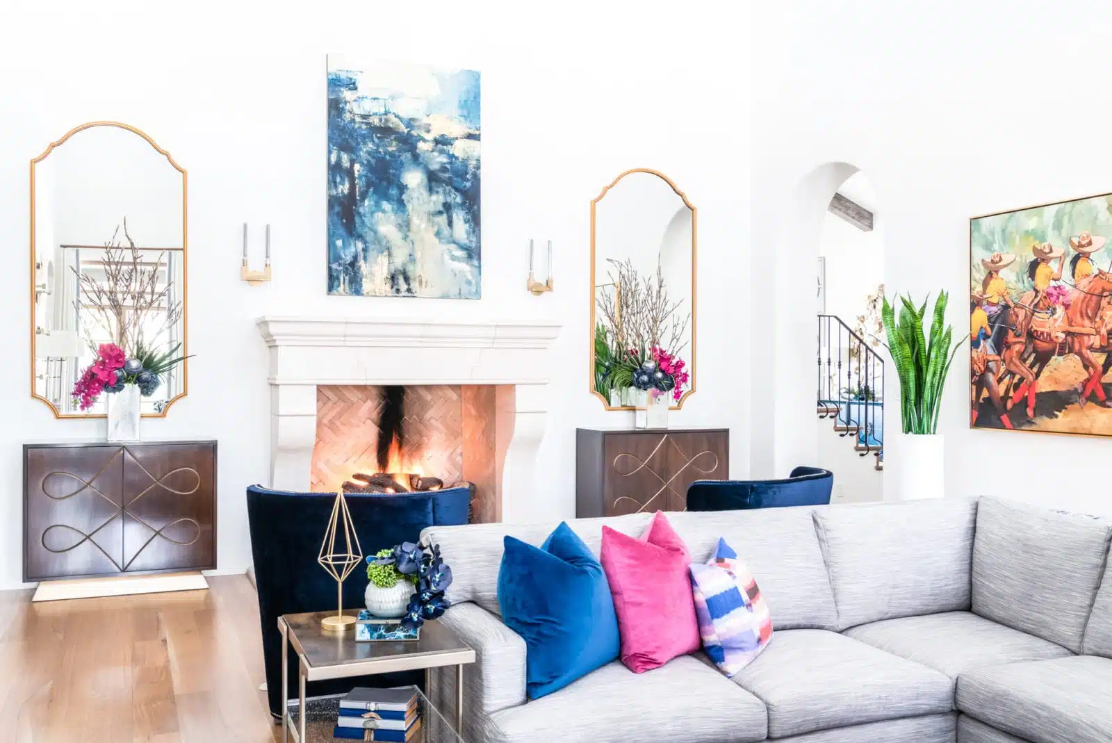
Have you ever made a massive decorating mistake without even realizing it? There are a lot of interior design common mistakes to avoid. It happens to everyone… you are shopping and see the perfect home decor accessory. Immediately you think, “Oh! this will look perfect in my living room!” Of course, you give into the impulse buy and excitedly bring home your new-found treasure, only to discover that what looked liked the ideal accessory doesn’t look right when put in place, and you are left saying, “What was I thinking? Where did I go wrong?”
What most of us don’t understand is that interior design takes a very keen and knowledgeable eye. We may be out shopping and see something we love, but that doesn’t necessarily mean that it will look perfect in our home. At Baker Design Group, our interior designers understand how color, lighting, room size, scale and placement all affect how items look in a room and dictates whether they will make or break a room design. There are a lot of common mistakes that almost everyone makes when designing their interiors.
Follow along as we look at the 10 most common mistakes and how to avoid making them.

Mistake #1: Rugs that are the wrong size or orientation
In a common area like a living room, a rug should be wider than the width of your furniture so that it serves as a base. In a bedroom, it should be perpendicular to the bed.
Mistake #2: Exposed clutter
If you are going to have open storage, like shelves or nightstands that have an open base, it is important to consider what you are going to put on that, because that becomes your design. Our Dallas designers make sure to include a variety of neatly-organized accessories and pay attention to color groupings.
Mistake #3: Buying furniture that matches too well
You do not want your home to look like a furniture showroom. A collected look always adds the most personality. For example, Baker Design Group would not recommend matching a bed frame with matching end tables because it will just make your room look like a catalog. The best designed rooms are the ones that look like they have been collected over time. And choosing items that are functional for you and your lifestyle.
 Mistake #4: Not enough lighting
Extra lighting doesn’t just make it easier to see, it also helps a space feel more dynamic. Sometimes lamps seem to scare people or seem superfluous to them. A fully engaged room should have 3 types of lighting, and that is not referring to three bulbs in your 4 bulb ceiling fanlight kit! Overhead lighting can be used for brightness and intensity, task lighting can be used for focus and intentional production areas and ambient lighting can be used to add to the overall mood or levels in the space! They don’t all get used at once but you’ll be surprised that they truly do all get used!
Mistake #5: No accessories
It’s the little styling touches that make a space look and feel complete. Do not underestimate how important they are. It is always nice to have a budget made and leave some money for art and accessories. Those purchases are just as important as the big pieces of furniture, the rugs, the TV or whatever it is you are looking for to fill your space.
Mistake #6: Wall art placement is all wrong
Artwork is typically hung either too high or too low and is not the right scale. It may not work in all projects, but our designers suggest placing the center of a piece 60″ off the ground or 4-6 inches above if you are hanging above furniture.
Mistake #7: Exposed cords
This may not be a big deal to most, but for BDG designers, it is a huge no-no! Try to disguise cords as best you can by using adhesive backed cable tie mounts or taping cords down with tape that matches the flooring or trim color. If you can’t hide them, we recommend grouping the cords together so it’s not a mess of jumbled cords.

Mistake #8: Going for a look without considering your budget
You can follow everyone on Instagram and flip through every Pinterest picture, but at the end of the day, your design project needs to fit your intended budget and aesthetic. The BDG designers are here to make sure that happens and keep you both dreaming and grounded in your pursuit of design beauty.
Mistake #9: Sofa placement
Your sofa can, but doesn’t always have to go up against a wall. Especially in a large space, sofa placement is key when it comes to designing and defining your conversation space. Pull that furniture off the wall, ground it with a large area rug and a couple accent chairs, and you have the perfect, off the wall entertainment space!
Mistake #10: Small spaces
Small spaces can be tricky, but they don’t have to be! Common design mistakes made are using dark, heavy fabrics and large-scale furniture in the room that can create a cramped feeling. Using linens and other lightweight fabrics can soften the space and makes the small space feel light and airy. The lighter color palettes allow light to reflect throughout, opening up the space. Focus on adding vertical components like drapery or art to bring your eye up and give your space some visual height.


As you have read, there are a lot of common mistakes that can be easily made when it comes to interior design. Luckily, there are also plenty of easy solutions to fix these mistakes. Sometimes it’s as easy as getting rid of a hand-me-down that you dislike but felt obligated to keep, while other times you may need to enlist the help and keen eye of a friend.
Have you made any of these mistakes in your home? We would love to hear from you!

If all else fails and you are too frustrated with all the decorating decisions and obstacles that you face, then Baker Design Group is always here. Our designers are knowledgeable and can help you achieve your dream home without all the mistakes. Give us a call today at (972) 417-3800 or send us an email at info@baker-designgroup.com!
