
Second on our list of ways to make our homes look good is PAINT.
Today I’m going to give you 20 great shades of white paint and some that I’m not a fan of. (my sucky-white list)
Getting the right white is not always so easy. Maybe it’s one reason that some people think it’s boring? I hate it when people consider it a cop-out and deem it boring. Hopefully, if you’re one who feels that way, by the end of this post, you’ll have changed your view-point. If not, that’s okay too. I think that there is nothing more beautiful than white on white. Nothing.
.jpg)
.jpg)
You might want to take this time to go and grab a sandwich and then please come right back.
Ever go to the store and ask the guy for a gallon of white paint and then you get it home and it looks horrible? Once it’s up, you realize that it’s really pink, yellow, green, or BLINDINGLY WHITE? Here are some of my favorite go-to whites and/or the opinions of designers I really, really trust. Whatever you choose, I recommend that you always test on all four walls and look at different times of the day and at night. A movable sample on poster board or a small piece of sheet rock (which is sold at most paint stores), is the way to go.
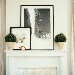
Before I get into my fave shades of white, here are some images for inspiration. (hopefully) A lot of these first images (but not all) are of Scandinavian interiors. They love white and do it to perfection! They are masters of it and I’m hoping that after you see some of these images, that you will realize that white is indeed a COLOR. And I think, the most beautiful of them all!

Above two images via
I am sticking to mostly Benjamin Moore colors because where I live, most contractors prefer it and it is readily available. However, I am also going to stick in a few from Farrow and Ball and Pratt and Lambert. The former is pretty costly— for paint that is. But it’s worth it. The colors are complex and wonderful!
Please also enjoy some beautiful rooms by designers known for their use of white.
From now on… Benjamin Moore = BM
BM- WHITE DOVE. You can never go wrong with the dove. It is a soft warm white with a teensy touch of gray.
BM – LINEN WHITE. I prefer it in brighter rooms. It is a classic cream and looks very lovely paired with white dove for the trim. An alternative to this color is
BM 905 – LILY OF THE VALLEY. This is a lot like linen white, but just a hair brighter. I did it once in a family room full of gorgeous built-ins. I have an old photo but it’s on the laptop which is recuperating from surgery at the puter hospital.
BM – 904 WHITE BLUSH. It looks ever so slightly pink on the chip, (and the name also implies pink) but when it goes up, it’s very lovely and soft and creamy and not at all pink. It looks wonderful with taupes and grays. It does not look good with yellow, however.
BM – 925 IVORY WHITE. I used this once in a darkish north facing living room and it was very lovely and warm.
BM – 967 CLOUD WHITE – This is another very pretty white with just a whisper of cream
BM 2145 70 COTTON BALLS – This is from their “newer” fan deck.
True Story Time.
Circa 1999, there were many complaints that the BM colors were “too muddy.” (hmmm…) So, BM did a Coca Cola and brought out the New BM fan deck aka: COLOR PREVIEW. (what evs). Okay. I’m being very nice when I say that at least 90% of these colors that they obviously forgot to preview are gag awful. However, if you can stand to sift through the intense chromatic hell that the BM suits thought was the antidote to “muddy,” there are some incredible gems. One of them is Cotton Balls. It is a Clean, CLEAN, but warm, lovely, lovely white. Really beautiful for walls or trim with any other color. BTW, those “muddy” colors like Abalone, Horizon, Nimbus and Revere Pewter are WILDLY popular now. There’s a moral there, somewhere, I’m sure. What I will never forgive is that when the new (COLOR PREVIEW) was suddenly foisted on us with its putrid array of the insanely bright, I nearly passed out.
Suddenly my “go to” colors didn’t exist! How could they do that to us?!?
Except, they really did, (if you KNEW to ask your local BM paint dealer) but BM forgot to tell us lowly designers (who are only their bread and butter ) this little factoid. And then.. circa 2004 when the “classic colors” (ala “coke classic?”) came (back) out, it was like finding a long-lost friend who had been hiding out on the French Riviera or something. I was both P.O.’d and over-come with this intense sense of gratitude. Strange. They say that it’s ONLY paint. Only thing is… that’s a nasty platitude. There is no only.
End of Story.
BM 2143-70 SIMPLY WHITE – The name says it all.
BM DECORATOR’S WHITE – an enduring classic white
BM DECORATOR’S WHITE mixed 50/50 with LINEN WHITE — This one is a little secret that’s no longer a secret. Although, I’ve never actually tried it, but it makes so much sense. Dec has slightly blue-green undertones and linen, slightly gold… and together, makes for a sublime creamy white.
BM 2143-70 MOONLIGHT WHITE- This is actually one of the Darryl Carter colors which just to confuse us into thinking is a different color is also called Huntington White DC-02. However, they can call it whatever they think will sell the paint because whatever Darryl is selling… I’m buying. He’s a genius. The next four rooms are his and I would be in heaven living in any of them.
Benjamin Moore BRIGHT WHITE This is a favorite of guru Vicente Wolf. Since he can do no wrong, I am not going to dispute his choice, however, guess what? There is no such color as Bright White. Believe me, when I tell you that it is undoubtedly not Mr. Wolf’s boo boo here. I have been interviewed many a time for an editorial and when they come back to me 2 minutes before it’s going to press, I am lucky if three words are actually what I had originally said. So, I researched this and I believe that he was referring to SUPER WHITE which is a very lovely clean brilliant white.
The next two exquisite images are by Vicente.
BM – PAPER WHITE. This is a white with a slight gray tint and I had some bookcases painted this color in a room already painted a warm gray with a hint of violet. I had the inside of the cases painted orange. It looks amazing!
BM – WHITE. Who knew? Their plain white is very nice for trim with either clear or cool colors. It does not look so great with gold. For gold and khaki, I love one of the creamier whites like linen white or Mayonnaise. My apartment has BM white trim everywhere. I will be honest and tell you that it looks wonderful in the bathroom and good in the bedroom. I have a lot of different whites in the living room with the HC-4 Hawthorne Yellow. I really do not mind it, however, if I were choosing the color, I probably would’ve gone with Cotton Balls. I did paint my Donald Cabinet Cotton Balls and well… it’s so, so pretty!
Now, for a few faves from Farrow and Ball and Pratt and Lambert. F and B is expensive as I said, but the colors are magnificent and complex. Pratt and Lambert is another favorite company. They have a far smaller collection of colors than Benjamin Moore, but most of them are winners.
Farrow and Ball POINTING 2003 – Pointing is a beautiful white with just the right amount of cream. (I know… there are a lot of these. Don’t knock yourself out. haha.)
Farrow and Ball ALL WHITE is a very crisp true white which looks wonderful in more contemporary settings.
Farrow and Ball WHITE TIE Another very nice cream color.
Pratt and Lambert ANCESTRAL. My old living room was painted this color and I lived with it for 12 years and never ever tired of it. It’s soft and warm. I discovered it because Victoria Hagan had painted her home in the Hamptons that color. There’s a good reason. The colors after it on the fan deck look green. Ancestral is in no way any shade of green. It’s a lovely cream. I recommend it highly, however, my room was quite bright and I think that it is better for a bright room.
Pratt and Lambert SEED PEARL, a clean, warm white- Seed Pearl is a fave of many designers and I know that Victoria also uses this color. She’s a huge fan of P and L.
And finally Pratt and Lambert SILVER LINING which is not in any way silver. It has a teensy, eensy, weensy bit of gray. It is very close, I think to white dove. It’s another great one, especially for trim.
Erika Powell of Urban Grace Interiors
***************************************************************
So, are there any whites which I think suck? Well, yes; however, my suck might be someone else’s go-to.
Here is my short list of sucky whites that sound less sucky than they really are.
BM China White. Some designers love this color. I think it looks dirty. It’s warm, but dirty looking, IMO.
Atrium white. Pink undertones which is fine if you want a pale, pale pink. Again, there are some who like this color, however, I think it needs a LOT of light to look good.
Bone white. No. Dirt. yuck. Stay away! I think they finally got rid of the even more putrid Spanish White. It was like the dog had peed on the wall. I’m not kidding.
Antique White. Well, if you like peach it’s okay, but if you don’t want peach, steer clear.
Navajo White. Another one that some designers love but I think looks just a tad too beigey-barf and neither here nor there. It’s an off-white for wimps. However… my former neighbor had terra-cotta/ burnt orangey kitchen walls (actually BM spiced pumpkin which I had used before and like) and a sage-green living room and used Navajo for the trim and it was very pretty. But her tile on the fireplace was beige.
One common mistake is painting a dark room bright BRIGHT white thinking that it will make the room look brighter. Often, it just looks gray and drab because north facing light is blue-gray. I don’t recommend white for most dark and north facing rooms, but if you do, I would try one without the gray but instead warm undertones usually work best.
If you paint the room all white, should you paint the trim a contrasting white?
That is a matter of preference. However, the trim should always be in a semi-gloss paint. (I once went into a home where some idiot painted the walls in gloss and the trim in flat.) I still very much prefer oil-based paint for the trim, but the latex paints are better than they used to be. I don’t think that they sell it in New York anymore. (First they’ve taken away our lovely oil paint and soon they are going to be taking away our incandescent light bulbs!!! Did you know that?) Painters often prefer latex because it’s easier to work with, however, nothing beats oil (for the trim) for that pearly rich luster.
xo,
![]()
PS: I love hearing from my readers! I really, really do. The blog is for general advice.
I am happy to help with your specific interior design issues, be they paint or anything else, but there is a fee beginning at $60 for that help.
If it’s a fairly quick question, you can go to the sidebar and click on the button which will take you to a secure paypal gateway and then I’ll be happy to help you!
If it’s more extensive than that, please contact me to discuss and I can come up with a fee based on the scope of what it is that you need.
Related Posts
 20 Great Fireplace Mantel Decorating Ideas
 The Best No Fail Benjamin Moore Gray Bathroom Colors
 The Most Common Interior Decorating Mistake {how to avoid it}
 Home Staging Ideas You Won’t Hear About on HGTV
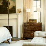 Freshen Your Home for the New Year {part III | wall paint!}
 Freshening Your Home for the New Year {part V – wall art ideas}
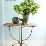 20 Home Interior Painting Tips You Need to Know
.jpg)


by Laurel Bern
Great sample of interior designs I really like it !
You are amazing! I have scoured so many blogs, Pinterest, images for hours etc looking for the information you provided. I think I have a new thing, overuse of ipad while searching for white paint shoulder injury!Thank you so much.
I have simply white, moonlight and super white samples on my south facing walls and I need something in between simply and super. Super is too white and simply goes too warm at night. Moonlight is even warmer than Simply but lovely. Do you have a suggestion for my next test pot?
Love what you said about some of the whites. Thank you for being so honest, really helps!
Oops, spelled my name wrong, it’s Brooke
Hi Brooke! Thank you for making my day! Based on what you said, maybe try decorator’s white? Also, maybe get a sample of white dove. best, Laurel
Thanks!
Now I am searching your blog for the color you used on your white cabinets and walls! Care to say?
I have white dove in my hoard, I’ll try it. I’m also going to try Snowfall white, have you tried it? Have you painted any doors black? That is on my list. My gray owl walls are going blue so it’s all going white and black !
For the kitchen [that’s taking forever to be finished] that I’m always talking about? Those are white dove and it’s gorgeous! I haven’t used snowfall white, but it’s only available in gallons because of the recipe. They have it all calibrated and sometimes it’s not possible to make it in a quart for some colors. Most grays have some other color that pops out and the most common one is blue. I have shoreline 1471 in my bathroom and it’s pretty true. I like it a lot– very pretty. I’ve also heard that stonington gray hc-170 tinted at 50% is a true light gray.
I did once paint the doors and the base moulding black in a family room. It was really cool. I don’t remember what we used though. It might’ve been a Farrow and Ball color.
Hi Laurel,
I am doing a kitchen Reno and choose white dove for the cabinet. What other white would go perfectly with white dove as I am struggling with the wall color.
Thank you so much!
Linda
Hi Linda,
Good question! It’s a bit tough to advise on that without knowing the other elements in the room such as back splash, counter and floor, as well as what is going on in the adjacent room(s). x, Laurel
Hello Laurel,
Thank you so much for the quick response. We have dark wood floor. White cesarntone counter top. And I am thinking about either white subway tiles or something that has a hint of grey as backsplash. For the family room right next to it, I am deciding between beige or light grey sectional. Thats all i have for now, everything else is still up in the air as there are just too many things going on with renovation!!!!!!!
Thank you again!
I have a new favorite white! My husband didn’t want pure white walls and white trim so I tried Ben Intense White. It is a perfect neutral, no green, blue, pink or yellow. It has a gray undertone but still looks white. There is a nice contrast with white dove or simply white because I have both on trim in different areas.
Linda, does which white cesarstone do you have? That is next for us. We are going to do white subway because it is so classic although I am tempted by the hint of gray or blue shiny subway tiles.
I had gray owl in my family room and it went very blue in my house. Revere pewter went beige. So, you really have to test.
Hi Brooke and Linda. That is very interesting about the Ben Intense White. What you’re doing sounds gorgeous, Linda! I love this pale, pale gray color. BM Paper White 1590. very lovely and would look great for that tone on tone different whites and pale gray look. We did it for some custom book cases where the backs were a reddish orange. Here is the post so you can see. http://laurelberninteriors.com/2012/10/17/a-lovely-home-in-armonk/
The client had already painted the walls and trim and they were Sherwin Williams I think. But a very soft warm gray with lavender undertones for the walls and probably something close to white dove for the trim. BTW, a BM color like that is Abalone 2108-60. gorgeous!
If you want a bit more color, these grays are all also very nice.
http://laurelberninteriors.com/2014/06/22/best-no-fail-benjamin-moore-gray-bathroom-colors/ [it says for bathrooms, but these are all great for kitchens too!]
All the best! x, Laurel
Thank you Laurel. That bathroom looks breathtaking!!…I wish they could label all the paint color used.
Hi Brooke, please check out http://www.caesarstone.ca. We choose 5141 frosty carrina. It would be more perfect if it has just a bit more of grey.
Thanks again. Had no idea choosing paint color can be so stressful. Gonna go through your blog for more great ideas!!
Hi Laurel,
I love this page! The photos are so amazing! But I am having such a hard time choosing whites. I would like to use SIMPLY WHITE on the trim, but my mom says I need to choose a different color for the doors. First, is this true? Second, how do you choose complementing whites? I thought maybe SUPER WHITE but I am nervous that it will look too stark.
Thank you so much for your help!
Erin
Hi Erin! Thank you so much! No, I have never heard of painting the door a different color. Anything that is wood such as window and door casings, mantels, mouldings and doors should be one color. As for the walls, it is a completely valid design choice to use ONE color. I did in my old living room and lived with it for 16 years and absolutely loved it, however, I also had beautiful crown moulding and paneled wainscoting. What did I use? I used Pratt and Lambert – Ancestral. It’s a very, very pretty off-white, somewhere between cream and white, but very soft. You can see it in the portfolio image with the cat [my beautiful Peaches] on the glass and wrought iron coffee table. If you choose to paint it one color, please use semi-gloss for the trim areas and matte for the walls. The contrast in finishes in one color is a beautiful, simple, elegant look. Hope that helped! Let me know how it goes! ~ Laurel
I am finding the whites to be very confusing! The walls in my kitchen were just painted SW Restrained Gold. I was told by an interior redesigner to paint my cabinets SW Fragile Beauty, but when I painted a board and put it by my appliances, I thought iit looked too creamy! What should I do? I need a soft white to not clash with my appliances and yet a color that compliments my walls. Any thoughts?
Hi Maryann,
I am gathering that your appliances are white. I don’t know what color your walls are. I am not as familiar with the SW colors. White Dove, Simply White and Cotton Balls by Benjamin Moore are all great choices. White appliances can look very cold. It is okay to choose a creamier color for the trim. Best of luck! ~ Laurel
Hi Laurel,
Thank you for your speedy response. Yes, you are correct about my appliances being white. I will have to look into those shades of white and what looks right in my room. I like a little of the cream look. I just don’t want it to look yellowed in contrast to my appliances. I enjoy reading your comments-entertaining and informative!
Hi laurel, We are finishing up a small bath with calcatta/Carrara tiling shower, and French gold fixtures. We want a very clean white look. We have 3 small walls, a door, and ceiling…was thinking linen white since you mentioned gold tones but was wondering if we should paint the door and ceiling a different white for a little contrast…any advice?
Now that I see linen white it looks too yellow. What do you think about decorators white for all walls and ceiling and door… Too stark? Tile has some brown and fixtures are going to be a light gold… Is there another white you would recommend to keep that clean airy bathroom feel?
Hi Laurel, me again. I am in trouble! I have committed a major no no and it’s taken four years for me to realize what I have done. I have been trying to get gray and white into a house with off white cabinets that I can’t paint. I want to but they are new and the finish will never be as nice if I mess with them. The trim paint was matched to the cabinets and they missed and it is eggshell which I detest.
I have tested colors trying to determine what my cabinet color might be in Ben and it’s very close to Grand Teton White. So I would like to paint the trim again in semi gloss and it could be Grand Teton or a bit lighter. Then I need to paint the walls an off white or cream but it can’t be as light as Simply White or White Dove, in my house they look white white and my family calls this “drywall” grrrr. I was considering Acadia but I am worried it will be yellow.
I am so glad I came back to this site because I had China White, Bone, Antique White and Navajo on my list for wall colors! Yikes. I am so much more comfy picking whites or grays than off white/cream.
Any trim and wall color suggestions? And which line of Ben do you use for trim?
Thank you so much! xo
Hi Brooke,
I will be more than happy to help you, however, I have recently added a payment gateway at the bottom of my sidebar.
It’s very easy and only $40 per question. I’m working on a more complete schedule of services that one can pay for in this way, but
for now, this will do. Thank you so much! Laurel
Got it. I’ll get my thoughts organized. Thanks, Brooke
Hi,
This post has been so helpful! What are the rules on paint color for ceilings? If I with White Dove on moldings, etc. should i go darker/lighter?!?! Can’t believe I’m stressing over a ceiling!
Thanks!
Hi Laura, Thanks for stopping by. Most people paint the ceiling plain old white. Except plain old white actually has a tinge of gray in it and the ceiling usually appears darker than the walls, anyway. Henceforth a dingy ceiling. White dove is a good choice, or you can mix it up ever so slightly and do White Cloud 967 or 2143-70 Simply White both good choices.
Lauryl-Hello from Oregon Thank you so much for this article and the one on grays! I was hoping you might have a white or cream suggestion for the exterior of our home. We chose to paint our single story 50’s house a dark gray (Behr’s dark ash). It looks great in small amounts, but now that the whole house is painted it has taken on a blue undertone. We started painting the trim white but it now the house looks even more cold and boring. I was hoping you might have a cream or off-white suggestion that would help it feel classy and elegant rather than stark and cold.
Thank you!!
Mary
Hi Laurel,
You say a common mistake is to paint a dark, north-facing room white in an attempt to make it brighter. What do you recommend? My living room is long and narrow. One end faces south with bright light, the other end is north-facing and dark. My sofa is dark brown. I need something that makes the room feel brighter/warmer and was thinking a creamy white would do the trick. Any suggestions?
Thanks,
C
Hi Laurel,
I love your article, thank you. I need some expert advice please. You seem to know a LOT about whites! We are doing a remodel, and wish to go with an “all-white” palette on walls and trim. Existing trim is BM White Dove, and we think we will stay with this throughout the existing and new/added space, both because we love it and because it is too costly to repaint all existing woodwork. Would also like to go with White Dove Walls (will that be boring??) OR Simply White walls with the White Dove trim. I am nervous, but hoping the clean palette will be lovely…also have not seen ANY blogs/articles/images of WHite DOve trim with Simply White walls! Also in your opinion can we use Super White on ceilings or should we do WHite DOve on ceilings too? THANK YOU!!!
brilliant white does exist for Benjamin Moore. It is on the Classic Colors palette, listed as EXT. RM.
Hi Anneliese. Thank you so much for clarifying that. And you are right, of course. I always wondered why they had those few colors in the back as “ext. rm.” It’s always been my understanding that any BM color could be made up in any formulation they carry.
It’s an interesting shade of white. Brighter than plain old white, but still with a gray undertone. I can see why Vicente would like it though.
Laurel if I was going to use the BM moonlight should I use it for the walls, trim and ceilings? I figured I would so the walls in a Pearl finish, the trim in a semi-gloss but what finish for the ceilings?
Love your site and such great info! I just painted my bathroom Glidden-drifting snow which is a white with a slight grey undertone. The problem i have is the walls are a brighter white than the trim. I don’t know the color of the trim, and cannot change the color of the trim because it goes through the whole house. It looks very odd with the walls lighter than the trim. Any advice on a different wall color I should go with? The trim looked super white before I painted, but now they look more cream next to the white walls. Any advise would be great!
This is exactly what I was looking for! I just bought a house that is completely covered in orangey wood trim and was feeling quite overwhelmed at the idea of having to pick a trim colour and paint the whole house (pressure!). You are an absolute savior – thank you so much for taking the time to put this list together.
Hi Kat,
Thank you so much for your kind comment! It’s especially nice because I’ve been grieving so badly the loss of my sweet kitty. Maybe he sent me a sweet “Kat.”
Do you give advice on colors? My kitchen walls are buttery yellow, white appliances and a faux granite countertop with black, gray, some brown and a greenish gray . I need to find a color to paint the cabinets. I’m thinking of white (or a light gray) and another color for the doors. I’m not sure what other color to bring in. Would appreciate suggestions. Thanks so much. Judy
After researching online I came across your blog. Which I am loving and very informative. I am in the process of painting my walkin closet and would like to go with a white. I am having a hard time picking out the white. The trim in there is painted a very light cream color with one window and track lighting (considering changing to a chandelier) Could you give me any advice on what color of white to paint please. Thanks
Great list! I would also include BM’s Chantilly Lace, one of my top go-to whites. I actually painted my entire design studio with BM’s Atrium White; the space has huge windows on all 4 walls so plenty of light and I found the color to be the perfect shade to complement my rustic, reclaimed wood furniture. I have never tried P&L paint but will be sure to try it now. Thanks!
Love your site and recommendations. My house other than the foyer gets no direct sunlight and has very short ceilings. I am leaning toward 80% Balboa Mist and was wondering which white to use with it to make the house brighter and get the ceiling to look taller. I have all wood doors, windows, and casing which I am staining in Walnut. My floors are porcelain tile Crema marfil and 7″ oak plank that I need to finish onsite and will go natural. I thank you in advance.
Hi Laurel,
We are renovating our kitchen and want to paint our cabinets in white. We have bianco romano granite countertop, gray porcelain tile floors, and tints of gray in the backsplash. The living room adjacent to the kitchen has two shades of grey one on each wall and ceiling in white. These are the colors I picked: Benjamin moore super white semi-gloss for kitchen cabinets and wall trims; white paint from home depot for the ceilings. Please advice if this is a good combination. Can you also suggest me a shade of white for the ceiling and walls that will look good with the super white semi-gloss kitchen cabinets.
Thanks,
Naga
Hi Laurel,
I’m so sad now that I’ve read your article about picking the right whites. I don’t want the outside of my house to look like a dog peed on it! Is Spanish White a terrible choice for a Spanish house? We wanted a warm white with dark brown trim…
If you have any other suggestions, we’d love to hear them.
-Lisa
Hi Laurel. We want to modernize and brighten a narrow hallway leading to 4 bedrooms. Currently, the walls are dark salmon and the plain doors are dark brown (paint). For ease of application and to achieve the desired new look, we are considering all white – walls, doors and trim. But which white/s? BM Cloud White has been recommended as suitable for all. We would love to hear your suggestions.
Great post! Just to let you know I emailed Charles Spada to ask him which white he used in that picture and he responded Cloud White. He said it’s his go to white for walls. He said he used to mix colors together, but finally relented that Cloud White is perfection without having to think about it.
Hi! I came across your blog as I am desperately trying to choose a soft warm color at 38 weeks pregnant to paint a dark north facing room where I will need to spend all my time with the kiddos. I tend to like cool colors, but I know this house really needs warmer colors. So wee decide to use Swiss coffee for ceilings and trim as opposed to ultra white like in our other house. My husband is hesitant to paint a white, but I would like to go with a neutral to keep it light and airy and happy. Do you have some coke suggestions that mught be close to white, so he feels like he got a color and I got a soft creamy white washe feel? I have valspar balance up as a sample now, but in morning and late lights it looks a bit “yolky” although not yellow in mid day. We also threw up bm tranquility and realized too too cool for this room. I’d like to leave the room open to match white or warm grey kitchen cabinets as we haven’t decided what color we want yet, adjacent room)
Oh, how I wish I’d read the above before mistakenly going with China White.
2 brush strokes and i was done. I’m on to White Dove. I love white!
Hello Dear, I’m in a bit of a pickle. I read all your suggestions on whites. I have an 1850’s farmhouse and recently retired from the Army so the remodel is in it’s height. I just painted all the woodwork in my kitchen BM Gamboge from the Williamsburg collection. A lot of woodwork. I’ve spent a small fortune getting the wrong colors to go with it. So I just purchased 4 samples of BM whites per your suggestions…ivory white, Lilly of the valley, cloud white and cotton balls. I then painted 4 squares on the wall and still I stare like a deer in the headlights. I’m not sure if this is a PayPal question, I only need one word Dear and I break out the roller. V/R Lynn E
Hi Lynn,
Try reading this post about how to choose a paint color.
http://laurelberninteriors.com/2014/08/15/ugh-hate-new-wall-colors-secret-getting-right-first-time/
Thank you Laurel for your quick reply. I woke up to your advice, literally. Although my kitchen is in the north corner I have many widows, large windows, old school windows. Ironically the room next to my kitchen I did in a colonial blue with a ever so slightly cream on the trim which looks a lot like the photos in the post. I wanted my kitchen warm and period, old but not ancient. You know what I’m saying. If I would have been smart, besides reading your great advice, I would have done the walls in the gamboge and left the cream on the woodwork, but sometimes the brain shuts down, and goes into “I got this mode” well I threw up a dark spicy color, long story short, a total no go! Hence the throw up. Well its come down to lily if the valley witch may be a little too much or cotton balls which might not be enough. But none the less there’s always Cloud, which is a hazy call, in a good way. V/R
I am so glad I found this article. My husband and I are building a house and have been agonizing over which BM shades of white to use. We have it narrowed down but I still had concerns. The warm whites you mentioned are the ones we have been considering. I feel so much more confident about purchasing the paint now. Thank you for writing this!
Help, Laurel! I’m hoping you can give me a teensy bit more of your amazing advice on the “right white” for my new construction home. I live in Colorado, where we have many sunny days, however, my family room, kitchen and dining nook are all north facing. The home was painted in what I thought would be a lovely greige, but it is way too dark, despite the decent amount of light we get here. I had BM Edgecomb Gray HC-173 throughout my old home, which i loved. But, sadly, the new color does not even come close.) I should also mention that we have many large windows in the home, on all sides. Because we lack the southern light in the rooms we use most, I am now considering an all-white re-painting of these rooms to brighten things up. Additionally using the same color in the entry, staircase and upstairs loft/landing area (which gets a bit of southern and eastern light from three smaller windows in our foyer.) All things considered, I am now scared that my home will look cold or drab if I choose the wrong white. I am not a lover of yellow-undertone whites. I am much more drawn to what I consider to be “cleaner whites”, with blue or grey undertones. But you say this is a no-no for north-facing rooms. Having read (and re-read) your post, I am now considering Cotton Balls, Cloud White or the Deco/Linen White 50/50 mix. Do these sound like safe choices???
Super helpful list! What might you pair as trim in a bath where the walls are BM Gray Wisp. White tub and toilet. Vanity will be same trim color. Corian top is slightly off white (hint of tan/gray in it).
We had Oyster trim in there because we used in another bath (perfect!) but in here the pink comes through more for some reason.
Hi Laurel,
I painted the exterior and trim of my house White Dove. I painted the shutters a SW color-Attitude Grey. I am not happy with the shutter color-it is a more ‘cool’ color, whereas the White Dove is a more warm color. Do you have a color you would recommend for my shutter color?
Thank you very much!!
Carolyn
Color consults begin at $60 for one color. [or $90 for a room with trim] However, if you want help in how to select a paint color, please read this post. This is how I do it!
http://laurelberninteriors.com/2014/08/15/ugh-hate-new-wall-colors-secret-getting-right-first-time/
If you still need help, there’s a button on there which will take you to the secure payment gateway.
Thank you so much for reading and for interest in my services! ~ Laurel
YOu are amazing and I just linked to your Secret to Getting it Right the First Time article. Question: the living room in Buckland Blue is fabulous. For a room with windows facing east and south (pretty bright), would white dove trim with Buckland blue be bad? Not able to change trim to Cotton Balls (DH insistent that I not). Thanks!
While brilliant white might exist, my designer friend worked with Vicente and says his go to was Super White as you deduced!
: )
please recomend me a simple combination of whites for wall and trim just so that it looks very clean
thankyou
[…] shades of white that evoke differing moods from cool and crisp to warm and comforting. You can even mix whites to give your kitchen depth and […]
Our home is loaded with cedar:1st floor is cedar logs milled flat, most trim is white cedar and LR/foyer has cathedral ceiling with cedar tounge & groove. All inside walls are sheetrock and currently white.
We are about to repaint walls & ceilings and my wife suggested BM Atrium White for walls. Then I found your article on whites.
I’m concerned because I don’t think Atrium is going to go well with the cedar. And the inside walls are subject to different lighting. Floor plan is very open and we have a lot of glass in both the DR/Kitchen (2 full sliders + 3 full stationary windows) with primarily western light exposure. LR/foyer has 5 full sliders, 2 full stationary windows, large 2nd floor windows and skylights. This area gets some morning sun but most light is then from north & west.
Would you recommend different whites for these two distinct areas?
Thank You. I’m very glad I found your article.
[…] choosing the right shade of white is just as important as with colors. Here’s a great list of favorite white paints to get you started. Remember, invest in some test […]
I took your advice and used 925 IVORY WHITE in my windowless bathroom and….it has a lot of yellow in it. I like it better than the ugly baby blue it once was, but I didn’t expect that yellow. We switched out to higher watt bulbs, so the brighter it is, the less yellow you see.
Hi Tina, I always recommend testing by putting up large movable samples of the color and looking at them at all different times of the day and night and on all of the walls high and low.
Hi!! This post is genius! I am currently ripping my hair out looking for the perfect white and I find this!! What are your thoughts on decorators white for all trim and dove wing on the walls? We are doing a lot of trim work. in a satin finish. Do we go matte on the walls? Advice?
Adrianna, I had to jump in before you buy satin for trim, you should use a semi gloss for trim and woodwork per Laurel s advice….matte on the walls, its still washable. You will be much happier with Ben Moore’s semi gloss for trim…its a dream paint. I just finished my kitchen in it.
Thanks Lynn!
yes, semi-gloss for trim looks best. But I don’t give individual advice for paint colors because it’s not fair to my clients who pay for that service. If you need a consult, please contact me directly.
What a great collection of photos showing beautiful, airy white rooms! I used BM Snowfall White for my doors and trim work with BM Revere Pewter, Chelsea Grey, Grey Horse, Thousand Island, Silver Fox, Pashmina and Barely Beige walls. It is a versatile white. I also love BM Deep in Thought which I used on my kitchen cabinets! Love Benjamin Moore colours!
Hi,
I love your blog. I am painting the walls of my sun filled apartment Linen White because I m looking for a warm neutral. Now I need to choose a color for a built-in and then the doors and trim. Should I do a 50/50 Decorators White/Linen as you suggest or a Dove White?
Lastly, I have a windowless bathroom whose shower and vanity white with marble top. The floor is a very light slate. I would love to do warm, light gray. Do you have any suggestions? Pearl Gray?
THANK YOU!
Paula
Hi Paula,
Thank you so much! There are too many variables for me to give you an educated answer for all of that. If you’re interested in a paint consultation, please write me through the contact form to discuss. best, Laurel